Friday Findings
Overview
Friday Findings is LabX's weekly science newsletter, built to make research feel approachable and enjoyable for people who aren't scientists. LabX, a program of the National Academy of Sciences, is known for experimenting with creative ways to make science engaging, and Friday Findings is one of those efforts: a curated set of studies delivered in a digestible weekly email.
My team partnered directly with LabX to evaluate and redesign the newsletter. The work centered on understanding why readers were opening the email but rarely engaging with it, and on delivering a flexible template system the LabX team could actually use week to week. Our primary client contact was Nawar Nemeh, Social Media and Marketing Manager for LabX.
The Problem
Friday Findings was doing its job on the surface. The content was genuinely interesting and aligned with LabX's mission, but the design wasn't helping that content land. Information was being presented to readers rather than designed in a way that invited them to explore it.
The engagement data made the problem concrete. Only 12 percent of recipients fully read the newsletter, while more than 81 percent simply glanced at it. Around 23 percent of clicks came from mobile, which meant a significant share of the audience was reading on their phones. The format wasn't supporting the way people naturally consume this kind of content, and readers were checking out before reaching the stories worth clicking.
Our goal was to understand what was driving that drop-off and redesign the experience to hold attention, improve accessibility, and make it easier for LabX to maintain going forward.
My Role
I worked on the design team and led data collection for the project. I contributed to the newsletter evaluation, helped shape the visual direction across our concepts, and worked on the accessibility and mobile findings that grounded our redesign decisions. Throughout the project I focused on tying our design choices back to what the research and engagement data were telling us, so that every recommendation had a reason behind it.
This was a five-person team project with a real external client, which meant balancing design ambition with the practical constraints of the client's tools and timeline.
Research and Discovery
We started by studying the existing newsletter closely. We reviewed its visual hierarchy, readability, accessibility, and overall aesthetic, then benchmarked it against email-specific design standards. Email behaves differently from a website, so we researched best practices for responsive layouts, rendering across clients, and accessibility in email specifically.
Because LabX built the newsletter in HubSpot, we also tested how tools like Canva, Figma, and Frame.io would fit into that workflow. It was important that our recommendations were realistic to implement, not just attractive on paper.
What We Found
Our evaluation surfaced a consistent set of issues:
Weak visual hierarchy. Every story used a similar layout, so nothing signaled what to read first. Headlines, images, summaries, and buttons all carried the same visual weight, which made the newsletter hard to scan. Since most people skim rather than read top to bottom, this was a core problem.
Text-heavy presentation. The intro and article descriptions felt dense. The information was valuable, but the way it was packed together made it easy to disengage before reaching the content. The 12 percent full-read rate reflected this directly.
Weak calls to action. The links were present but visually blended into everything else, so nothing pulled readers toward clicking. Since click-through is one of the main goals of a newsletter, this was a clear missed opportunity.
Personality gap. LabX presents itself as experimental, creative, and fun, but the newsletter read as traditional and static. It communicated information without capturing the curiosity that makes LabX distinct.
Accessibility concerns. Small text paired with long content blocks, contrast combinations that didn't fully meet best practices, inconsistent alt text on image-heavy sections, and long scrolls without strong visual breaks all made the experience harder for readers using assistive technology or reading on smaller screens.
Mobile experience. Even though the newsletter rendered on phones, it wasn't designed for them. Tight spacing, dense text, and small touch targets made the mobile read harder than it needed to be, despite mobile driving nearly a quarter of clicks.
The Pivot
Partway through the project, our scope changed. We had planned to build and test ready-to-use templates directly inside LabX's email environment, but access to their internal HubSpot setup and analytics infrastructure turned out to be restricted. We couldn't deploy or test inside their ecosystem the way we'd originally intended.
Rather than treat this as a dead end, we reframed the project around what we could meaningfully accomplish in a semester. We shifted toward a user-centered design and strategic optimization approach: evaluating the existing experience in depth, identifying what was hurting retention, and delivering high-fidelity prototypes and templates ready for LabX to implement themselves. The constraint sharpened the work, and it pushed us to think carefully about handoff rather than assuming we'd control deployment.
Design Development
With the research in hand, we moved into design. We created several early concepts that deliberately pulled in different directions. Some leaned into strong visual storytelling, while others used clean, well-defined content blocks. We explored modular card-based layouts, sequential editorial layouts, visually driven concepts, alternative CTA placements, and different hierarchy systems.
Using client feedback, we refined these through multiple iterations, evaluating each layout against accessibility, readability, modern aesthetics, and sound email design practice. That process narrowed a wide range of ideas into a focused set of final directions.
Final Designs
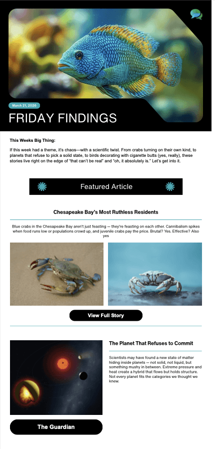
We delivered four high-fidelity template designs, each built on the same branding and design system, so LabX could switch between them and still feel cohesive to subscribers. Across all four, we focused on:
Stronger visual hierarchy that guides the eye to the week's lead story
Improved readability and clearer content chunking
A more modern aesthetic that matches LabX's experimental personality
Accessibility-conscious spacing and typography
Better mobile adaptability
Clearer, more prominent calls to action
The templates were designed to be used strategically depending on the week's content. A feature-heavy week can lean on a storytelling layout, a balanced week can use a more even article structure, and a visually rich week can showcase imagery. Because they share one system, switching between them stays consistent rather than jarring.
Implementation Guidance
Since deployment sat outside our final scope, we made handoff a deliverable in itself. We documented a realistic workflow the LabX team could follow: building each week's edition from the shared Canva templates as a content swap rather than a redesign, sending test emails before export, using Canva's built-in HubSpot integration to transfer the newsletter, and doing a final review inside HubSpot with specific attention to Gmail rendering, since Gmail makes up a large share of opens.
We also outlined longer-term recommendations: using HubSpot analytics to test subject lines, CTA wording, and article order; prioritizing Gmail compatibility across desktop and mobile in future testing; and maintaining accessibility standards like alt text, readable font sizes, and strong contrast every time the newsletter is updated.
Outcome and Reflection
By the end of the semester we delivered a full newsletter evaluation, a set of four accessibility-informed high-fidelity redesigns, and a practical implementation guide that LabX could carry forward on their own.
The biggest lesson for me was that meaningful design work isn't always about shipping a finished product. When the technical constraints changed what we could deliver, the value moved into clarifying the real user experience problems and equipping the client with strong strategic foundations and clear next steps. Working with a real client also meant designing for someone else's tools, timeline, and team, which made handoff and feasibility just as important as the visuals themselves.
Future work would focus on implementing these prototypes inside LabX's HubSpot environment, running live deliverability testing, and measuring engagement with real users to see how the redesign performs against that original 12 percent read rate.




Hey, I'm Madison Hueston ⋆˙⟡♡
UX Designer & HCI Researcher
M.S. Human-Computer Interaction candidate at the University of Maryland.
I design human-centered technology with a foundation in both code and visual design.
I am probably making something right now.